 Top UX design tips for disaster management applications" />
Disasters, such as floods, terrorist attacks, or earthquakes, per their definition, do not happen frequently, meaning emergency alert senders such as local authorities or emergency coordinators may only interact with public alerting systems on rare occasions. Let's explore how we, at Intersec, tackle the unique challenges of creating intuitive, efficient interfaces for those on the front lines of emergency response.
Instant clarity for emergency situations
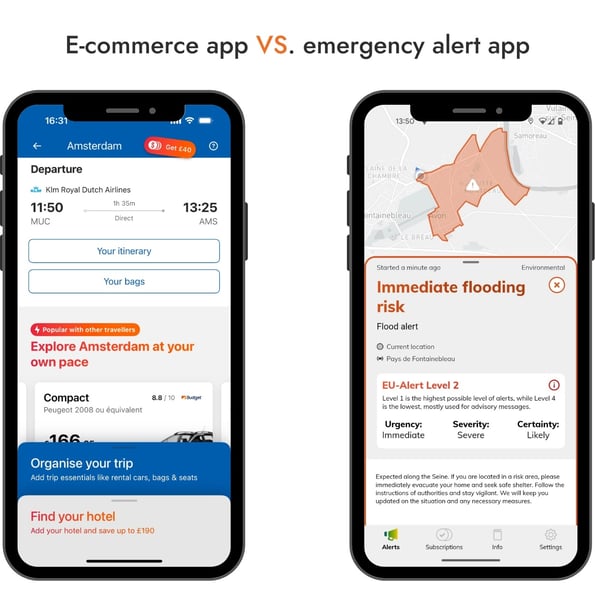
As every minute matters, crisis managers are asked to act quickly and with no hesitation—a tough request during stressful times. In the field of public safety, user experience (abbreviated ‘UX’) and design play a crucial role, which differs from the usual UX one could experience on e-commerce websites. It extends far beyond aesthetic appeal, such as a specific non-serif font or the latest shade of blue in trend.
For crisis management applications, an effective UX directly translates into operational efficiency and faster response times. The ability to quickly and accurately send alerts, respond to emergencies, and coordinate rescue efforts hinges on interfaces that are intuitive and user-friendly, and that efficiently assist users in stressful scenarios.
The goal is not to please the eye of the user, but to implement everything possible to ease their work and prevent errors that could have severe consequences.
Simply put, e-commerce UIs try to capture user attention by any means to sell them products, whereas public safety apps need to be concise and focus on delivering essential information.
Guiding users with stress-free UX practices
Users should immediately understand what’s happening on screen and how to perform key actions. This requires thoughtful layouts that guide them naturally through their tasks, even under stress. At Intersec, this is achieved mainly by:
- Reducing the number of immediately visible elements: this might naturally lead to an increased number of clicks, but if those clicks are "confident clicks", then we did our job right.
- Keeping any informational text in the contextual help boxes as concise as possible. Otherwise, the text is ignored altogether, including important explanations.
- Using strategic color-coding and visual hierarchy to emphasize critical elements without overwhelming the user. For a validation process for instance, it is a good practice to have a vivid red button showing the action is not live yet. For zone mapping features for floods, we generally go for blue.
- Incorporating safeguards to prevent accidental activation of critical functions while ensuring that these safeguards don’t hinder swift action when necessary: before sending an alert, you get a confirmation pop-up, to make sure the right message is sent to the right audience.
Here is an example of a contextual help box:
Universality is a key ingredient for efficiency. Consistent design elements reduce learning curves and allow quick adaptation when seconds matter most.
This example shows clear and concise guidance on the message to send and the area covered: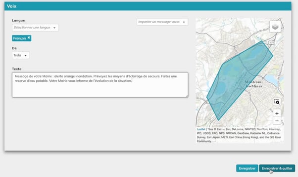
AI-assisted crisis response for smarter decisions
With clear visual cues and concise instructions, the user has proper guidance. But how can he be reassured that his commands have been successfully executed, and more importantly, to the right people?
For the past years, AI has been a worldwide buzzword, and for legitimate reasons. AI can step in to greatly simplify decision-making for the user. By leveraging AI to guide users through complex tasks, we ensure they can act quickly and confidently. A smart AI assistant can do the heavy lifting by suggesting the right actions at the right time. Chatbots are good examples: they can draft clear and context-aware alerts in any language in one click.
One could also think of a system that previews evacuation routes on a map-centric user interface based on real-time traffic. When it comes to sending evacuation instructions during a crisis, things can get complicated quickly. Emergency responders must tailor messages based on how close people are to the site. They might need to send different instructions to those nearby versus those farther away, and follow up with new messages as the situation changes over time. AI assistants can:
- help manage this complexity by keeping track of who received which messages and when. This allows emergency responders to send targeted updates as the crisis unfolds, ensuring everyone gets the right information at the right time.
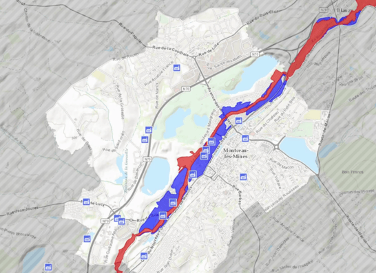
- provide valuable visual tools like density maps. These maps show where people are evacuating in real-time, using color changes to highlight areas where evacuation is going smoothly or where obstacles might be blocking progress. This visual insight helps responders make informed decisions about where to send additional teams to support evacuation efforts.
In summary, effective UX in public safety systems isn’t just about usability; it’s about creating solutions that save lives. By focusing on clarity, accessibility, and error prevention, we can help public authorities respond faster and more effectively when every second counts.
To dive deeper into the topic of Early Warning Systems, visit our page.
.jpg)
Editorial team
LinkedinThe Intersec editorial team is made up of professionals who share expert insights on AI-powered innovations, mission-critical communication solutions, and 5G location intelligence across civil protection, homeland security, and telecommunications.

Cell Broadcast Emergency Alerting live in 10 days
47 deployments. Four continents. Active conflict zones. We're not generalists who added public warning to a product catalog. This is all we do — and we're faster, deeper, and more adaptable than anyone.


.webp)


.webp)